The Pantone 2026 shade is here and these are the home pieces I am choosing
Tara ĐukićDecember 5, 2025
December 5, 2025
As the year draws to a close, we are met with endless lists, roundups and forecasts. Only yesterday everyone was discovering Spotify Wrapped for 2025, and today the main topic is the Pantone Color of the Year for 2026. This time it is not another mocha, peach or viva magenta, and many would probably hesitate to even call it a color. The Pantone team chose Cloud Dancer, a soft, airy white, because the world is, quite simply, exhausted. We are looking for a pause, for relief, for emotional detachment, for a break from visual overload, say the experts from the Pantone Colour Institute. We just want to withdraw a little.
Cloud Dancer is an evident visual response to that collective burnout. They describe it as an elevated shade that feels like a breath of fresh air, a symbol of a calming influence in a frenetic society and a reminder of the importance of thoughtfulness and quiet reflection. The pandemic accelerated everything, from technology and remote work to constant digital noise. People are searching for truth and meaning more than ever before. Am I in the right place in my life. Where do I want to be. Is this the person I want to live with. We need emotional clarity, balanced thoughts and a clear perspective when reflecting on ourselves, and from that point of view, despite mixed reactions, I find this Pantone choice more than fitting.
Since 1999, the institute’s international team has tracked influences from fashion, interiors, art, film, travel and geopolitics, distilling all of it into one shade that captures the spirit of the times. The name of the shade is just as important. It helps convey emotion, and people need to understand the message instinctively. Cloud Dancer does exactly that, suggesting height, lightness and a view from a distance above the chaos.
View this post on Instagram
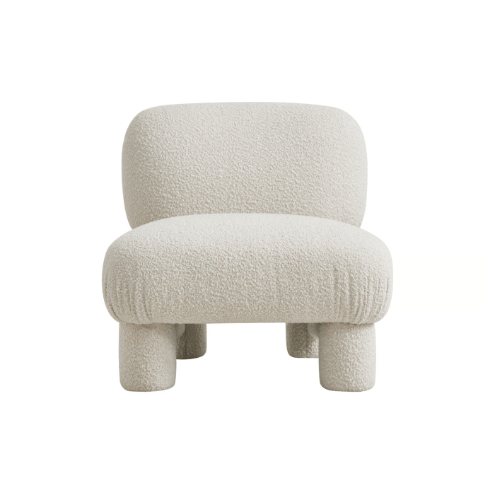
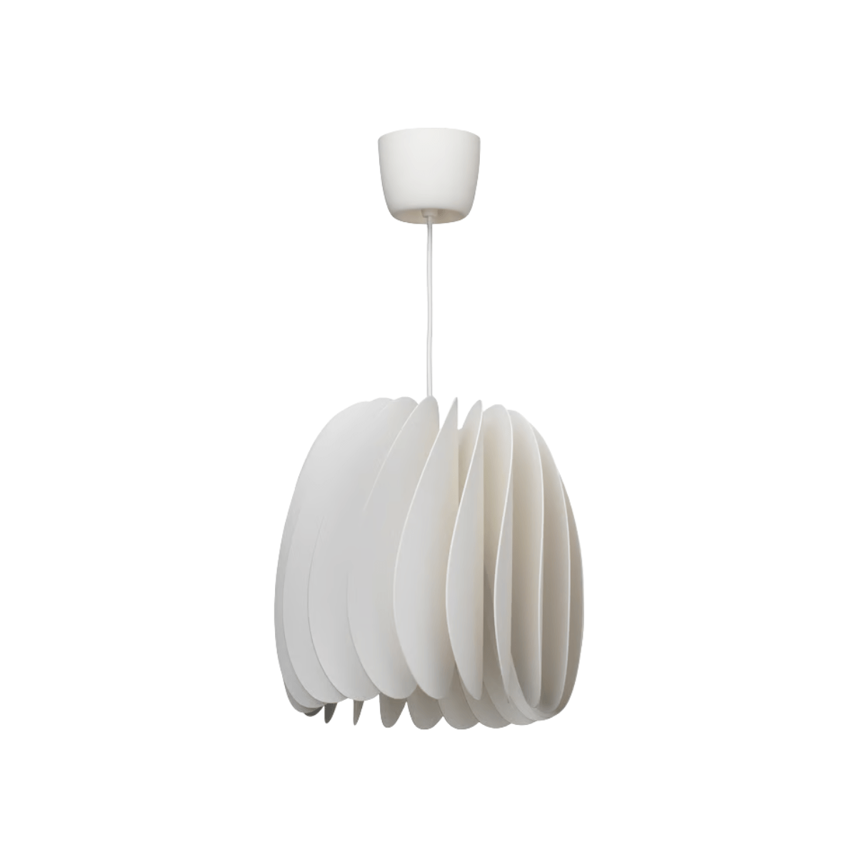
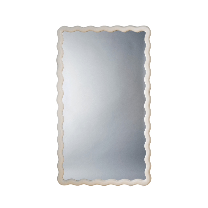
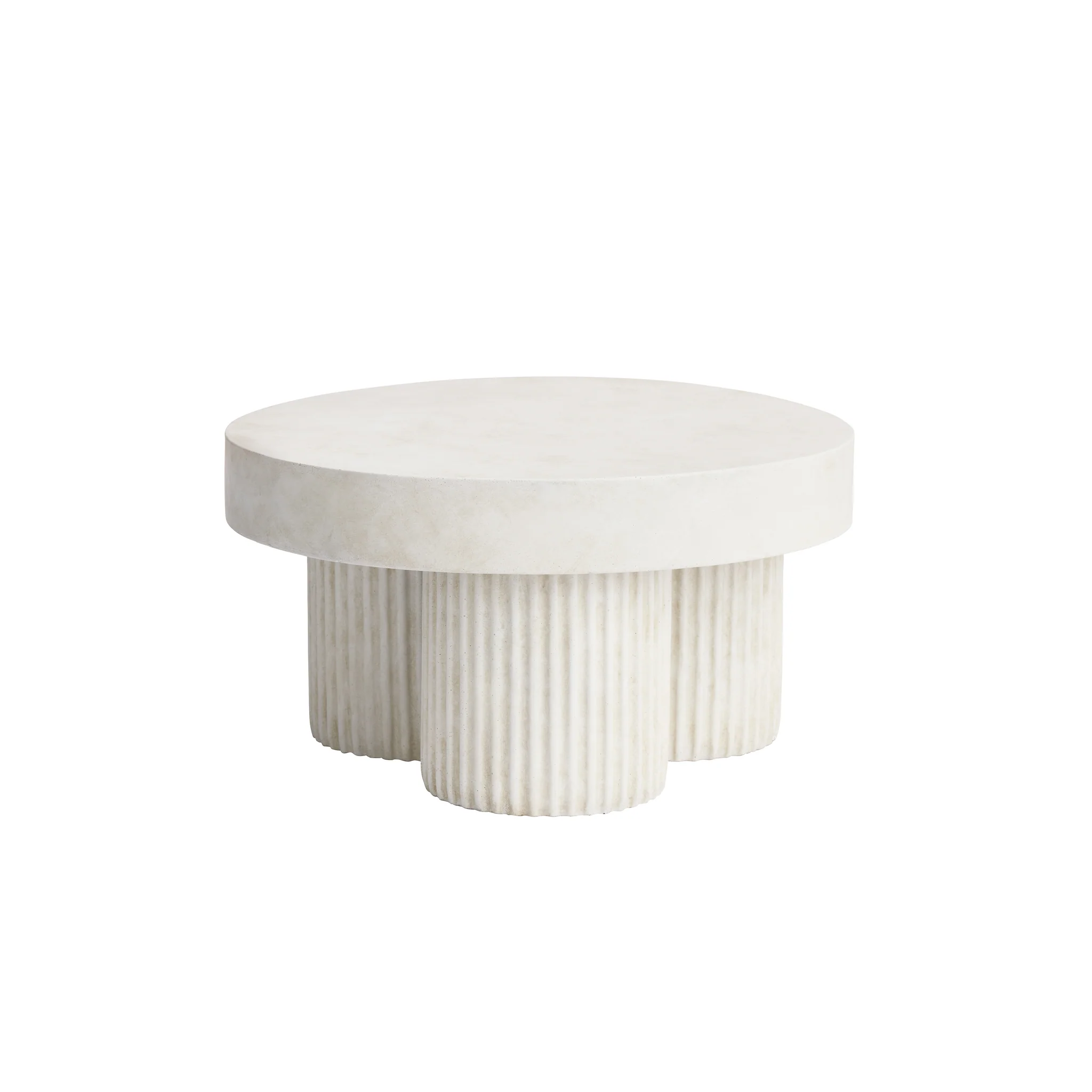
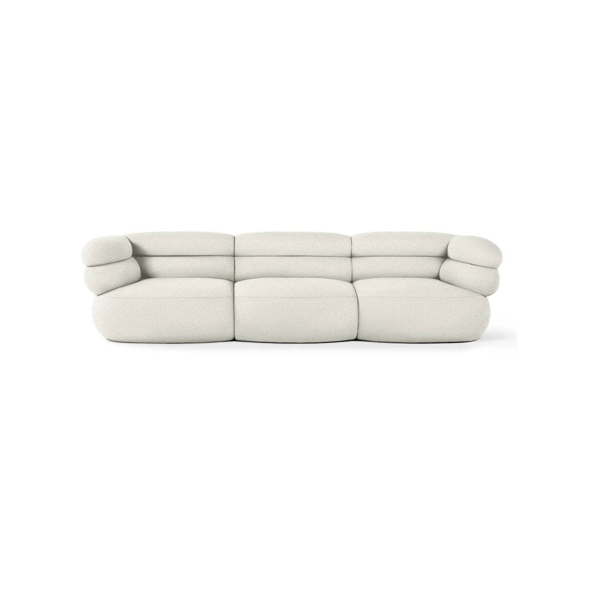
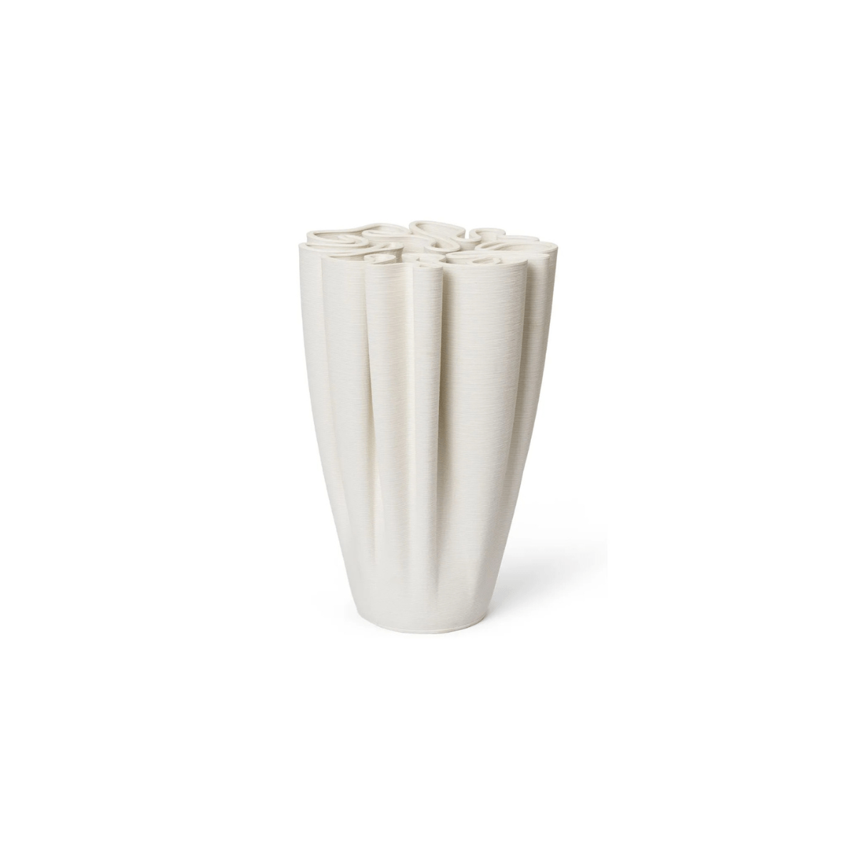
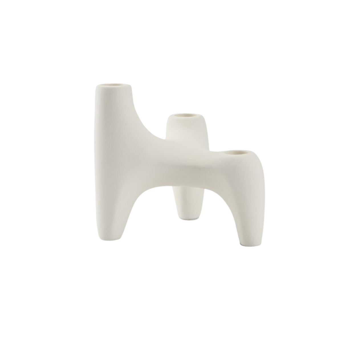
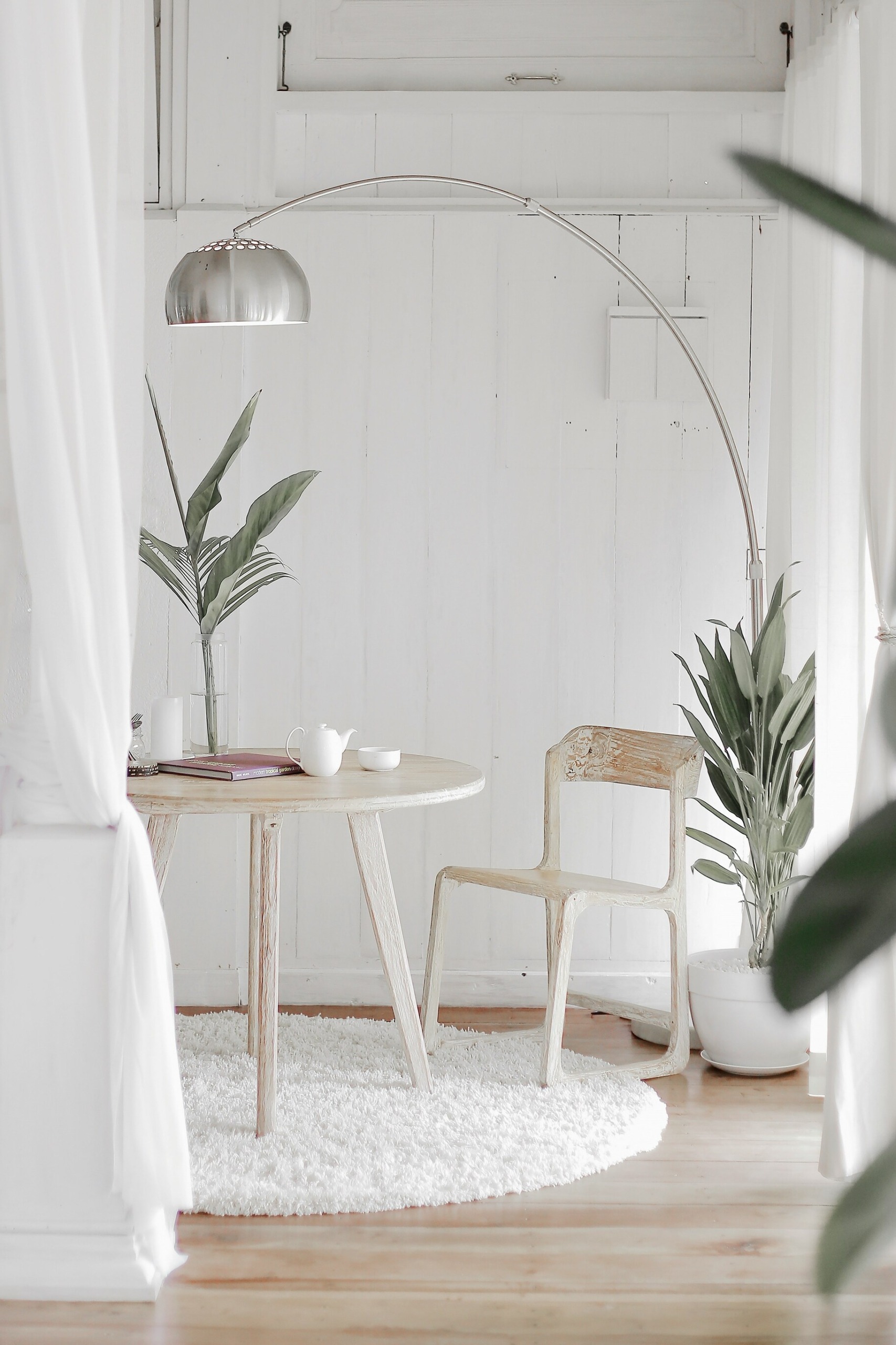
The soft grayish white is as adaptable as clouds moving across the sky. It is neither sterile nor harsh. It feels more like a balance of warm and cool undertones than a classic neutral. It has no seasonal limitation, and whether used in fashion, interiors or technology, it conveys a sense of considered elegance, careful intention and a conscious approach to minimal luxury. In interiors, Cloud Dancer creates spaces where function and feeling intertwine to build an atmosphere of calm and openness, with texture doing much of the work. Rounded furniture forms, soft textiles, spa like bathrooms and airy bedrooms that encourage relaxation all play a role. These balanced, versatile qualities allow Cloud Dancer to soften even the loudest color blocking, though it can also stand on its own in a fully monochromatic palette, offering a quiet, meditative foundation from which inspiration can emerge.
In the end, the message is clear. Pantone’s 2026 Color of the Year invites us, in our search for new answers, to look toward the sky rather than the ground. It is time to start sharing things without filters and spectacle, to rediscover the value of the present moment and to find joy in simplicity and the unbearable lightness of being.
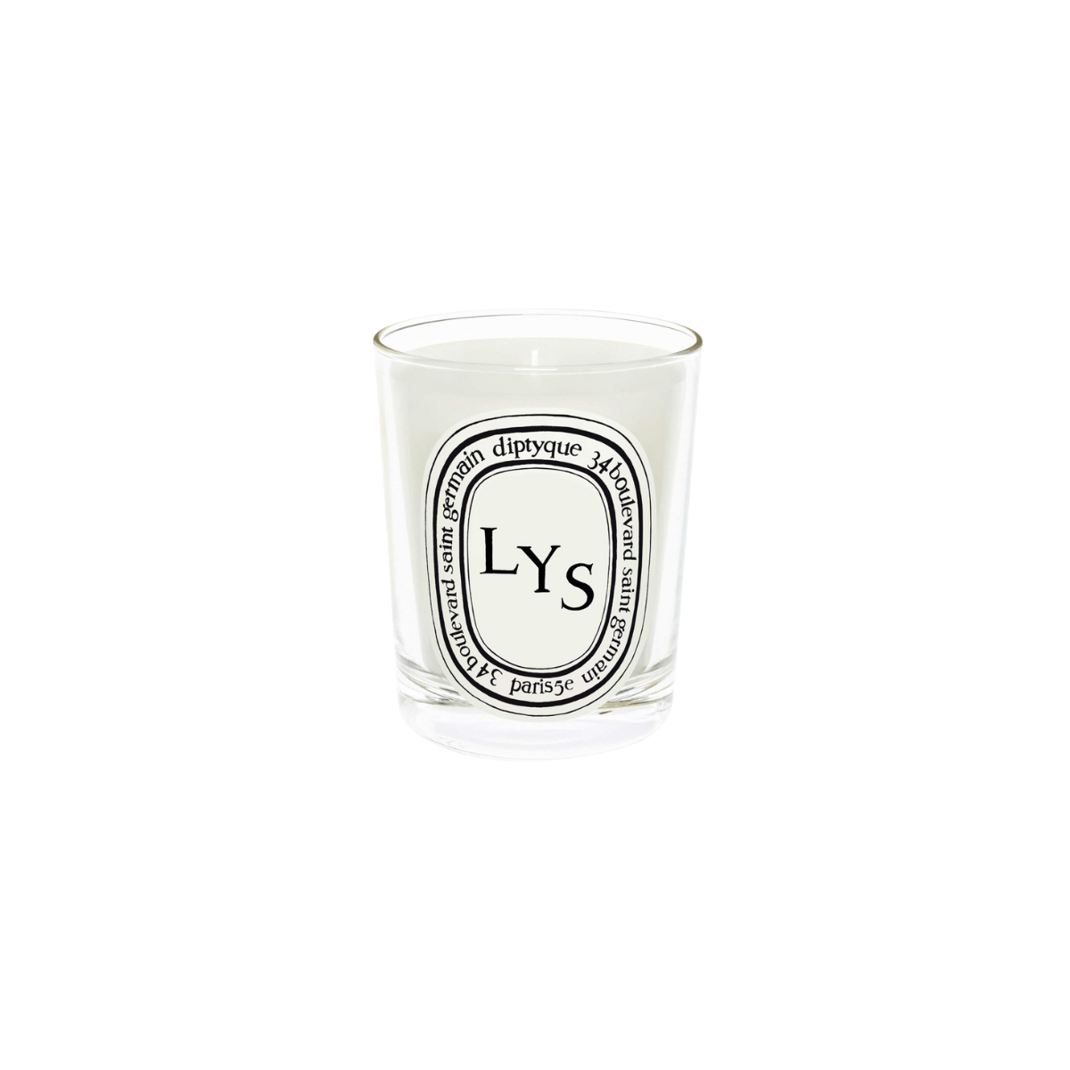
Below I have selected my favorite home items in the Cloud Dancer shade that have already made their way into my shopping cart.